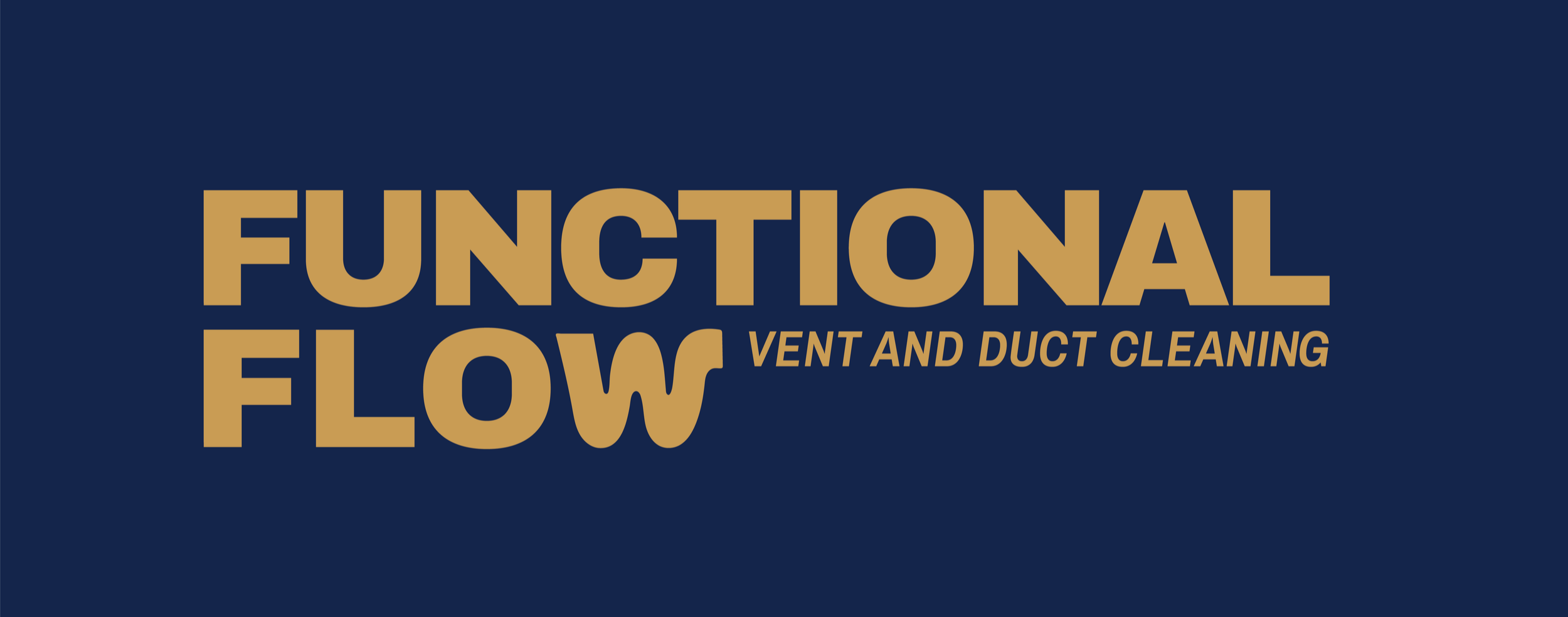
FUNCTIONAL FLOW
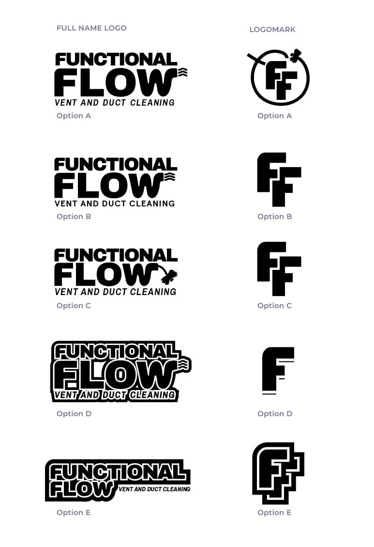
For this vent and duct cleaning company in San Diego, I wanted the logo to feel bold and easy to read - something that shows strength and reliability right away. To keep it from feeling too serious, I added a playful touch to the “W,” giving it a wave-like shape that hints at airflow and ducts. It’s simple, clean, and has just enough personality to stand out while still feeling professional.

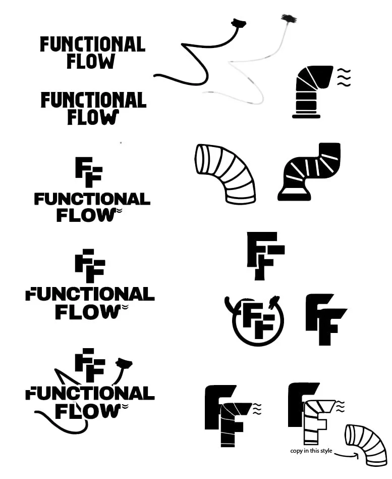
THE DESIGN PROCESS
We kicked things off by sketching out ideas and trying different fonts that felt strong and masculine, but not too stiff or heavy. From there, we played around with ways to bring in the duct/airflow element without overcomplicating things. Once we landed on a layout that felt right, we refined the details, like giving the “W” that little wave, to tie everything together and keep the logo bold, clean, and a little fun
FONTS

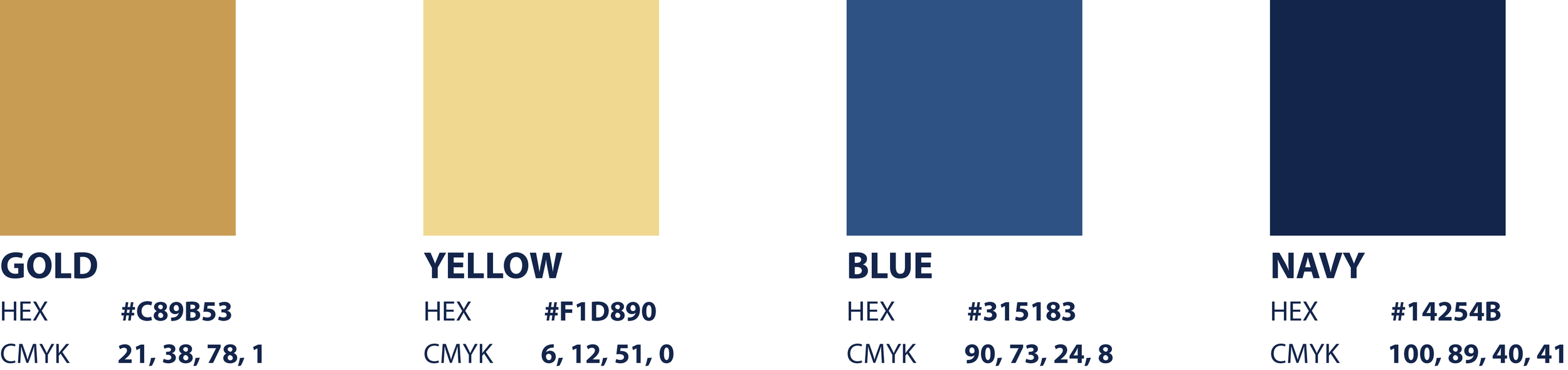
COLOR PALETTE
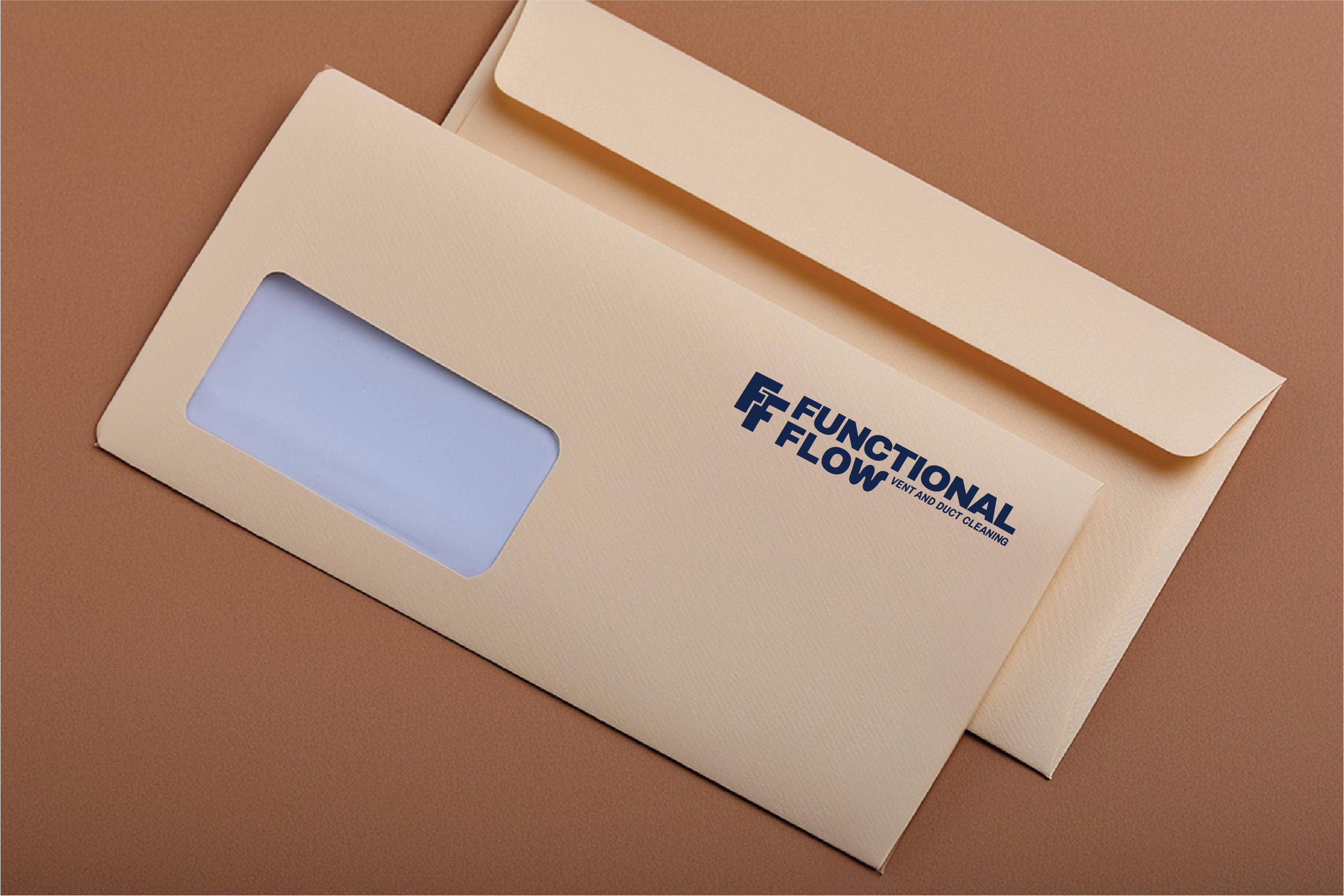
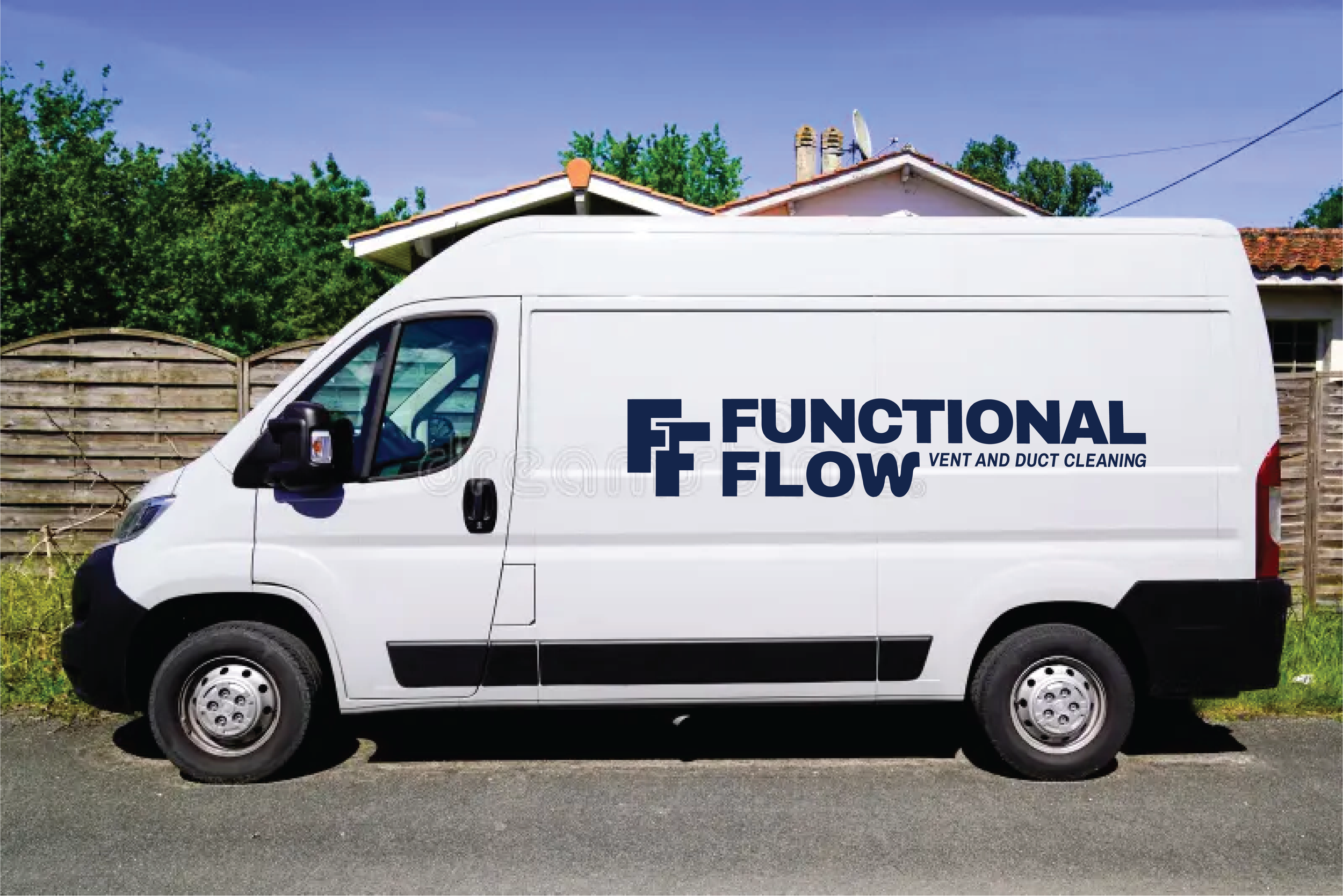
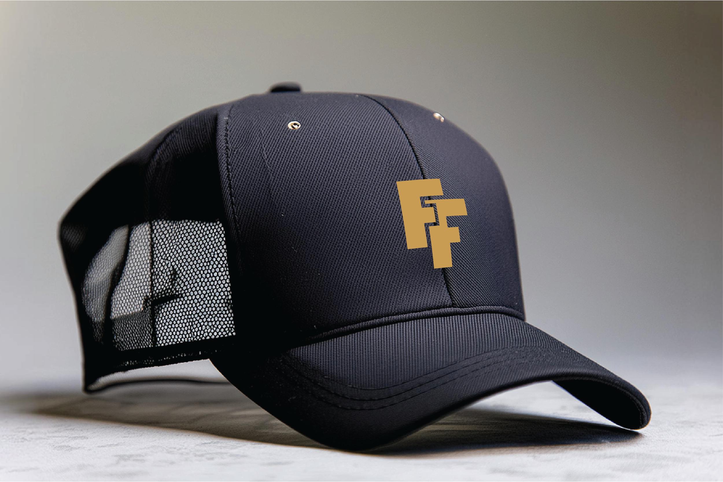
MOCKUPS